Color psychology is an essential consideration in commercial painting services. It helps to guide the tone of a business and encourages certain emotions and responses from its employees and customers.
Whether you want to increase productivity in your office or encourage shoppers to spend their money, understanding color psychology can help you achieve your goals.
Colors that Affect Mood
It’s no secret that color affects mood, so marketers have known how effective it can influence consumer behavior for years.
When choosing colors for your business, it’s essential to consider your target audience and goals. For example, greens can evoke feelings of optimism and productivity, so they’re perfect for office spaces. Meanwhile, reds are energizing and can increase heart rates.
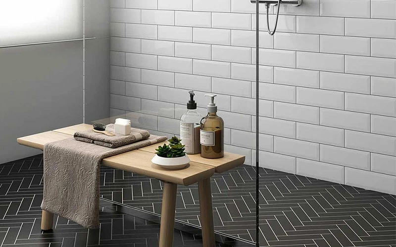
Blues and grays are calming, so they’re great choices for bathrooms. Some studies have shown that blue can help people relax and focus more easily. Other colors that create a relaxing environment include yellows and purples.
It’s also important to remember that different cultures may perceive specific colors differently. Although some research has focused on the effects of color on human behavior, the theory is still developing. However, new theorizing draws on evolutionary psychology, emotion science, retinal physiology, and person perception findings. In particular, a growing body of evidence suggests that people’s associations with colors are influenced by social learning and can be altered by other factors (e.g., cultural context and prior experiences). It makes the potential for cross-cultural applications of color psychology intriguing.
Colors that Encourage Purchases
Businesses that sell products online and in brick-and-mortar locations rely on color to help them make sales. The right colors can encourage shoppers to spend more time browsing and purchasing. Blue is one of the most popular colors in this area, as it evokes feelings of trust and loyalty. Other soothing shades, such as green and purple, encourage consumers to stay longer at a store.
Bolder shades can also increase sales. When used sparingly, reds with an orange tint can add energy and excitement to a room. However, being careful with these colors in commercial spaces is essential, as they can provoke irritability and anger.
For a more modern look, metallic colors are a great option. They create a sense of style and luxury, as well as durability. However, these colors are best reserved for upscale or trendy spaces, as they can be overstimulating in more traditional rooms.
Utilizing color psychology in commercial painting services has another benefit for businesses by enabling them to connect their brand to their industry. For instance, a company in the healthcare sector would use blue frequently due to its relaxing effects, but eco-friendly businesses might use green due to its natural implications.
Colors that Increase Productivity
As a business owner, you know that productivity is critical for your company. However, you may need to realize that your employees’ work environment is the most significant factor in their level of productivity from 9 to 5. If they’re exhausted and unmotivated, it can take them a long time to get through an 8-hour day.
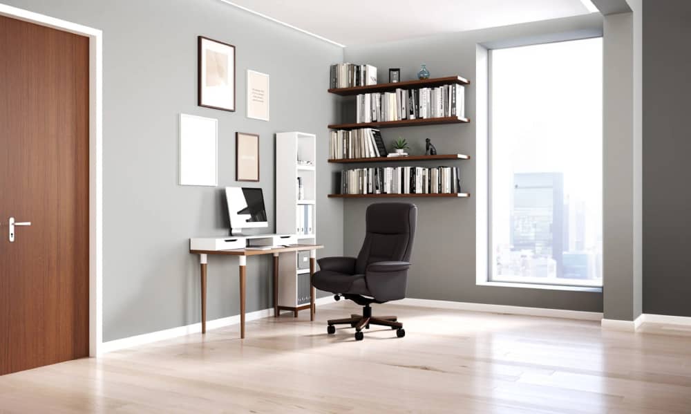
The good news is that altering the colors of your team’s workstation may boost productivity. According to color psychology, certain shades can encourage focus and inspire creativity. For example, orange is a great choice for a workspace because it stimulates energy and is an excellent color to use in offices with a lot of physical activity or high-stress activities like customer service.
Another good option is blue. Since it mimics the sky and water, this is a soothing color that can help reduce stress and tension. It also evokes feelings of loyalty and trust, which are essential in a professional environment.
However, it’s important to remember that only some shades will work similarly for all audiences. For instance, young people are typically attracted to bolder colors, while older adults tend to favor more muted shades. Understanding your customer base and how specific colors affect them is essential before hiring commercial painters to apply a color scheme to your business.
Colors that Increase Sales
Regarding sales, color is a powerful tool influencing how people spend their money. According to surveys, up to 90% of purchasing decisions are made solely on color. That’s why retailers need to carefully consider the colors they use in their stores and the effect they will have on customers.
Using paint colors that reflect your corporate culture and draw the demographic you want to attract is one of the finest methods to boost sales at your store. For example, orange is a vibrant attention-grabbing color that communicates a sense of urgency and low costs to shoppers. In comparison, gray paint conveys a sense of neutrality and reliability to your clients.
Additionally, it’s critical to remember that color psychology differs depending on a person’s gender, age, and income. For instance, younger customers are more attracted to bright, vibrant primary and secondary colors. In contrast, older adults tend to prefer muted and neutral shades.
By considering the psychological effects of various colors, you can create a retail space that encourages productivity and customer satisfaction.


